Member-only story
Confirmation button placement
To the left or to the right?
You’re filling out an online form and want to hit submit. Where do you expect the next/submit button? To the left or the right of the online form or page?
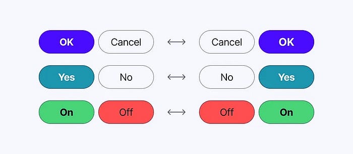
The convention has been to place the confirmation button on the right side, following the natural reading and scanning patterns when reading from left to right.
Placing the confirmation button on the right aligns with the user’s expectation of progressing forward, swiping or turning a page and completing an action.
But not every designer agrees. I can’t count the times I clicked “back” instead of “next” because the button was placed to the left. I disliked this awkward user experience. I wasted time (and sometimes had to fill out the form from the beginning).
Placing the submit button to the right makes more sense because it suggests an intuitive content flow as if going to the next page when reading a book. It progresses forward, has momentum and ends with a conclusion: “submit”!
Here are my button placement and design guidelines:
● The cancel/back button should be placed to the left of the form or page as if actually going back.

